2010 UCR Data and the Brady Score Card - The Minuteman
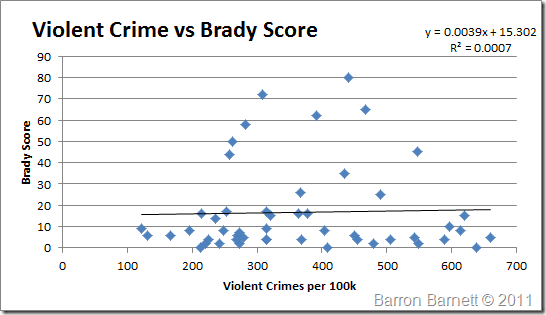
Recently the FBI updated their UCS data to reflect the information including 2010. For those who are new to the blog, earlier this year I ripped apart the scorecard against the 2009 UCS, as well as the 2006 census data.* I spent this morning updating my spreadsheets to the 2010 UCS data. Here’s the overall result: While R2 has increased, it is still inconsequential and shows absolutely zero correlation over the entire data set. It is worth nothing though the overall score vs. crime trend has gone from being slightly negative to positive. By looking at the plot, you can see that different scores are scattered across the entire field of crime rates. So let’s look at just states who scored above 50. Correlation decreased for all scores above 50, however it still shows a positive trend towards an increase in violent crime. This trend though, like the overall chart is extremely weak due to the low R2 value. Again a low correlation, however again it’s a positive trend for a higher score. Still only three states, 15%, with a score above 20 had a crime rate below 300. Those still were sitting toward the higher crime rates. Again I normalized the data and examined the distribution confidence. For this graph I took everything around the peak normalized value for 25% of each side. In other words everything between the 25th percentile and 75th percentile is included. Notice how it looks like a shot gun blast, though what is interesting is the cluster of points with low Brady scores. That region includes 24 data points, of which only 8 have scores above 20. The highest scores amazingly appear with that confidence range, along with every other score. So as previously noted the Brady score means absolutely nothing. Linoge has examined the 2010 UCR as the pertain to firearms. He has also detailed other firearm related data from the CDC. Seeing Linoge's graphs, as well as mine has given me an idea for a couple more graphs that I want to create to help view trends in context with other data. There's another project for me to work on. *You are free to repost these graphs, however I must request that you provide a direct link back to these posts. Some individuals seem to think that providing credit to those who put forth the effort to create these doesn’t really matter. Please, don’t be that dick. It takes a lot of time to organize the data and graph it. If you don’t feel it takes that much time, do it yourself. So if you want to use these graphs, feel free, please just provide proper credit. Continue reading →
TMM