Please see the update at the bottom or this post!
So the Brady Campaign released their updated scorecard for 2011 this year. I saw it earlier last week and kept meaning to update my spreadsheets. I know it’s pointless but it’s still good to numerically show how pointless it is.
If you actually believed the doom and gloom provided by the Brady Campaign you would think that the streets were rivers of blood. I uncovered something that you might want to stick around for. Read to the end for the icing on the cake that I found after comparing 2010 to 2011.
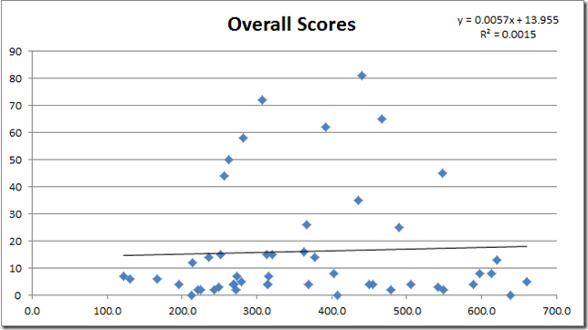
Before getting into that, lets get the quick run down of charts out of the way. For reference, here is the 2010 card with the 2010 UCR. Here is the similar data from a year ago with the 2010 score card with the 2009 UCR. It must be noted that this data does not reflect the UCR data from 2011 as it has not been released by the FBI yet. Expect an update later this year when it becomes available.
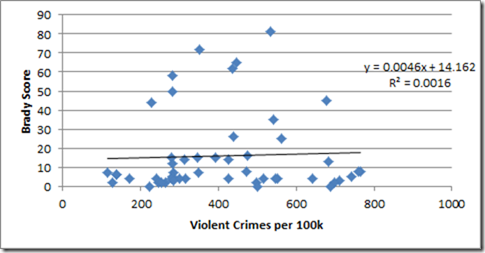
Here is the straight comparison of the score versus the violent crimes per 100k.
 (Old Graph, incorrect, old comments remain below)
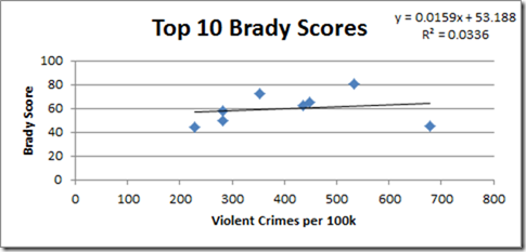
R2 dropped again to a value of 0.0016 and the correlation was calculated out to be 0.040117, while it did increase by 0.01, it is still completely insignificant and indicates there is no correlation between the Brady Score and violent crime. Moving forward though lets just limit this to the top 10 Brady Scores.
(Old Graph, incorrect, old comments remain below)
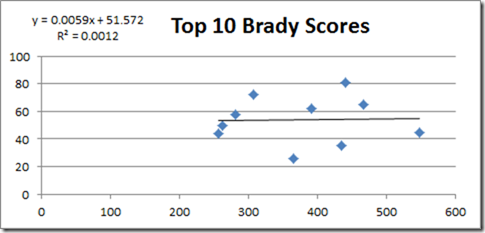
Again the correlation is non-existent with it coming in at –0.047. Anything that could be indicated by the trend line is irrelevant due to the very low correlation.
(Old Graph, incorrect, old comments remain below)
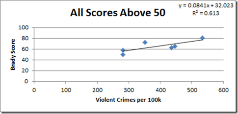
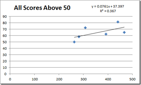
All scores above 50 had a correlation of 0.78 while the sample size renders it truthfully statistically irrelevant, it is trending in the direction opposite to which the Brady Campaign would claim. Next up though is all those with low murder rates.
(Old Graph, incorrect, old comments remain below)
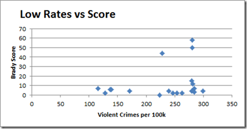
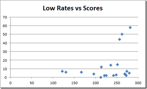
There are 20 states who’s violent crime rate is below 300 per 100k. The average Brady Score is 11.85. Only three states have a score above 20, and those with crime rates below 200, the lowest in the country, all have scores below 10.
As I said above I’m now working on collecting historical data for the Brady Scores as well as UCR data. The latter is much easier. One item that is critical and worth noting is that the Brady Data is suspect.
Not only is it suspect, but some states will have a decrease in their score not because they passed pro or anti rights legislation, but another state has. When the new legislation is passed the Brady’s to make their system look better will modify their categories to reflect it. Most importantly though, as noted above, they may falsely grade states inflating their scores. The biggest problem with that is the effect it can have by skewing the data to one side. Currently as Florida ranks #4 in the UCR for violent crime rates it would benefit them better to not inflate the score, however what’s to stop them from inflating the scores of the states with lower crime rates.
In closing on the straight comparison, as the last two times I did this exercise, there is no correlation between higher violent crime rates and a lower Brady Score. This can be taken as an indicator that the laws and “common sense legislation” does not have the effects they claim.
Bonus Discovery!
Now I said to read through to the icing on the cake at the end. It has become obvious as of late our opponents have been in denial and anger. They have been lashing out, some have been very angry, well here’s a wonderful graphical indicator as to why!
(Old Graph, incorrect, old comments remain below)
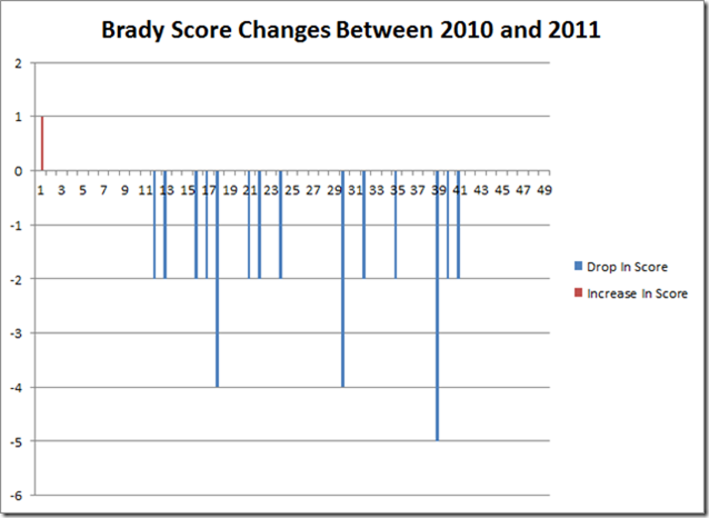
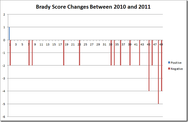
Every one of those blue lines represents a state who’s score had lowered. The reasons for the drop in score were tied to laws passed respecting the rights of gun owners. That sole red line is California who’s score increased by 1. The net score shift over the past year was –34 points. There were 14 states who helped with increasing the downward fall of the anti-rights organizations.
We won in 14 states, significantly based on their scores, while they barely got a point. That is why we are now seeing them go through the stages of grief. We must continue the fight less the cancer stop being in remission. I want the cancer attempting to destroy our rights to be dealing with the 5 stages of grief, not the law abiding citizen who’s rights they want to trample.
It’s so nice of them to keep score for us on how badly they’re loosing.
*You are free to repost these graphs, however I must request that you provide a direct link back to these posts. Some individuals seem to think that providing credit to those who put forth the effort to create these doesn’t really matter. Please, don’t be that dick. It takes a lot of time to organize the data and graph it. If you don’t feel it takes that much time, do it yourself. So if you want to use these graphs, feel free, please just provide proper credit.
Update (2/27/2012 1000 Pacific):I screwed up. Thank you to the observant individual who spotted it. I used the wrong spreadsheet for the UCS data and that is actually the 2006 census data. I will be updating everything to be correct tonight. I should have noticed that California shifted upward in the axis that should have stayed static. Attention to detail fail. I will write a post tonight along with a link to the spreadsheet for people to look at. These graphs will be updated to be correct as well, I will rewrite the current images for those who linked them.
So without further ado:
- I screwed up, and I used the wrong data set for these graphs.
- To many this could be considered misleading and attempting to hide the truth which impacts our credibility.
- Tonight I will fix all the graphs affected within this post overwriting the current images to be correct with the 2010 UCS. I will create a new post with this information as well and include a link to the spreadsheet used.
Those are the three parts of an apology being used in execution for those who aren’t familiar.
Update 2/27/2012 1930: See this post for more info (charts are being updated).
2011 Brady Scores with 2010 UCR XLSX document.
TMM is the owner, editor, and principal author at The Minuteman, a competitive shooter, and staff member for Boomershoot. Even in his free time he’s merging his love and knowledge of computers and technology with his love of firearms.
Many know his private name and information however due to the current political climate, many are distancing themselves due to the abandonment of Due Process.




Ok, now my head hurts.
An R2 value of 0.0016! Hahahaha!
Yeah, abysmally low correlation values, everything about it when you run the numbers says no correlation and thus definitely no causation. I keep doing it just to increase the sample size.
This is gonna surprise you, but I don’t value anything these people say. Good job pointing out just how wrong they are…again.
Actually that doesn’t surprise me. 😀
We all know that they’re grasping at straws, however many fall for the arguments we hear so often we now play bingo with them. Doing stuff like this helps those who might fall for the tricks see the lies.
Many don’t realize how graphical the human brain is. It’s naturally drawn to patterns and is so good it will create patterns where none exist. Using that pattern matching ability to show the lies works to our advantage.
This is an interesting study, because it is simple enough to be within the capability and attention span of most people to do themselves–I’ve done a similar correlation several years ago, with almost identical results.
I try and keep it all simple, easy, and reproducible.
Overall it’s actually very easy and simple to create the graphs, the hardest part is getting the data into the spreadsheet.
I went through the effort of normalizing to try and pull other info but it just wasn’t worth it since most just glossed right over it.
I have thought recently about doing a comparison of the distribution of scores below 20 and scores above 20. At initial glance it looks like both will be evenly distributed across the spectrum.
Even then though what would it show? The bottom line is gun control is a fallacy and these graphs along with the work of others shows how fake it is. What will yet another analysis show?
I’ve been through the 2010 data in detail…
States with less than or equal to the average national
Brady rating for their gun laws, have less overall violent crime (as measured by the FBI UCR stats) with ratios of
392 to 417 per 100000 respectively. Those 39 states which are at or below the Brady national average ( =17 points) are home to over 60% of the US population.
Short version, Brady’s ratings have no predictive
power relative to state level violent crime rates.
i.e. more gun control does not equal less crime.
This was true in 2003 when the CDC said “no extant form of gun control can be shown to have at
all reduced violent crime, suicide or gun accidents.” Nine years later and the evidence
is still against them, but they keep repeating the same nonsense.
Nice graph by the way. I appreciate what you and Linoge have done on these lines.
Thank you very much for this! It’s great to see their numbers exposed for what they are.