Recently the FBI updated their UCS data to reflect the information including 2010. For those who are new to the blog, earlier this year I ripped apart the scorecard against the 2009 UCS, as well as the 2006 census data.*
I spent this morning updating my spreadsheets to the 2010 UCS data. Here’s the overall result:
While R2 has increased, it is still inconsequential and shows absolutely zero correlation over the entire data set. It is worth nothing though the overall score vs. crime trend has gone from being slightly negative to positive. By looking at the plot, you can see that different scores are scattered across the entire field of crime rates. So let’s look at just states who scored above 50.
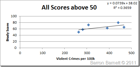
Correlation decreased for all scores above 50, however it still shows a positive trend towards an increase in violent crime. This trend though, like the overall chart is extremely weak due to the low R2 value.
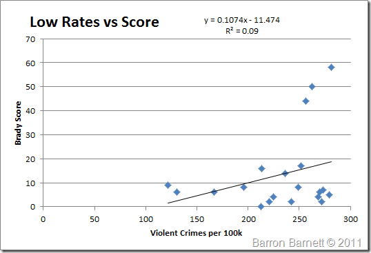
Again a low correlation, however again it’s a positive trend for a higher score. Still only three states, 15%, with a score above 20 had a crime rate below 300. Those still were sitting toward the higher crime rates. Again I normalized the data and examined the distribution confidence.
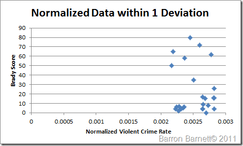
For this graph I took everything around the peak normalized value for 25% of each side. In other words everything between the 25th percentile and 75th percentile is included. Notice how it looks like a shot gun blast, though what is interesting is the cluster of points with low Brady scores. That region includes 24 data points, of which only 8 have scores above 20. The highest scores amazingly appear with that confidence range, along with every other score.
So as previously noted the Brady score means absolutely nothing. Linoge has examined the 2010 UCR as the pertain to firearms. He has also detailed other firearm related data from the CDC.
Seeing Linoge’s graphs, as well as mine has given me an idea for a couple more graphs that I want to create to help view trends in context with other data. There’s another project for me to work on.
*You are free to repost these graphs, however I must request that you provide a direct link back to these posts. Some individuals seem to think that providing credit to those who put forth the effort to create these doesn’t really matter. Please, don’t be that dick. It takes a lot of time to organize the data and graph it. If you don’t feel it takes that much time, do it yourself. So if you want to use these graphs, feel free, please just provide proper credit.
TMM is the owner, editor, and principal author at The Minuteman, a competitive shooter, and staff member for Boomershoot. Even in his free time he’s merging his love and knowledge of computers and technology with his love of firearms.
Many know his private name and information however due to the current political climate, many are distancing themselves due to the abandonment of Due Process.


With such low R2 values, you’re conclusion that “the Brady score means absolutely nothing” is absolutely correct. For anyone who disagrees, remember that the Brady campaigns whole premise is that lax gun laws increase crime rates. An R2 value of 0.0007 means that their premise is absolutely false.
However, I would warn against using the positive trend as evidence that restrictive gun laws increase crime for much the same reason; the R2 value is too small. I think John Stossel made this mistake in one of his videos.
Bottom line: gun laws have absolutely no affect on crime rates in either direction.
If you notice I state that all the trends are weak and not really valid. It is however worth noting that no matter how you slice the data, they all trend in the same direction and what that trend signifies. It’s currently insignificant most especially over the entire data set. When comparing over regions of the data set however the trend becomes stronger, it is still weak, insignificant, and could possibly be the result of noise, though strong enough to be worth mentioning.
It’s also worth noting that the correlations all actually decreased between last years data and this years data.
Next up is to do this on a longer historical scale.
If you try to compare crime rates between states, your analysis ends up being overwhelmed by Demographics and Economics. A way around that is to look at what happens when gun control is implemented within a state. That way the demographics and economics are relatively controlled… check out this analysis … http://www.georgiacarry.com/research/GCO_-_Guns_Good_Bans_Bad.pdf Its got 10 examples of the impact of gun laws. The update will include 2 more examples.
Barron, I tried what you did and came up with similar R2 in 2008. I even tried a control sample of random numbers and my R2 was much higher than what I got with the Brady scores. I even tried using the individual scores to see if one was more meaningful and focused on the different crimes. I got nada.
I’ve always wanted to try a multivariate regression analysis to correct for the demographic and socio-economic factors, then see if the Brady scores mean anything. I haven’t because I didn’t care enough about the Brady campaign. Here is an old Mustard / Lott report that does the regression analysis that might give you an idea of what’s needed, ie its alot of work
http://www.kc3.com/pdf/lott.pdf
Be careful about using murder data. I’ve seen studies (and of course I can’t put fingers on them now) where more than half of the murders are related to gangs and drugs, hardy activities licensed gun toters participate in.
Have you seen the State and Local Public Policies in the United States Report at http://www.statepolicyindex.com/ . They have gun law rankings that might be more meaningful than the lies from the Brady campaign since they should be unbiased. Here is a direct link to thier gun law spreadsheet.
http://www.statepolicyindex.com/wp-content/uploads/2011/06/b_guns_091.xls
Mike M. <- My email is on page 24 of the GCO report 😉
Thanks for the heads up. This is geared specifically at destroying the arguments of the Brady Campaign. Their argument is that “gun violence” should decrease given a better “Brady Score”. This is proven to be absolutely false by the facts above.
My next plan is to actually plot the scores and crime rates together historically for each state. Yes there’s a lot of variables to this and that’s the whole point of the exercise. Guns are not a big slice of the pie, hell they’re not even a small one, the sliver is almost atomic in size.
I know about the slew in the murder data. I find it much better to take their own skewed data, analyze it thoroughly, explain it, and then use it to chip out from under their foundation. Beating them at their own game with their own data is much more satisfying to me, doubly so if they’re trying to skew it.
I haven’t used the State and Local Public Policies report, I will probably look into using them in the next analysis.
I appreciate the input. I’m not going to go the multivariate route. I’m not getting paid for this and that would be a huge investment of time. I will however look at doing this a couple ways since I do have Brady Score data currently going back to 2006. I think the next way to blast this is a historical perspective based on the state.