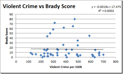
I stumbled across the 2009 FBI Statistics and figured I would update the comparison I did the other day. Unsurprisingly even with using the newer data, the results for the different graphs look the same.
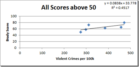
But the correlation dropped even lower to –0.015. The previous correlation already indicated that the score didn’t matter, this shows it matters even less when used with current data. The correlation for the upward trend of all scores above 50 decreased to 0.67.
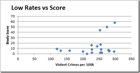
What is probably the most significant though from looking at the new data is comparing the states with the lowest rates to their Brady score. Again taking all states with a rate below 300 and plotting them with their score shows the following.
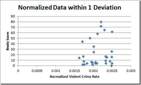
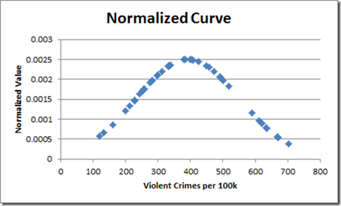
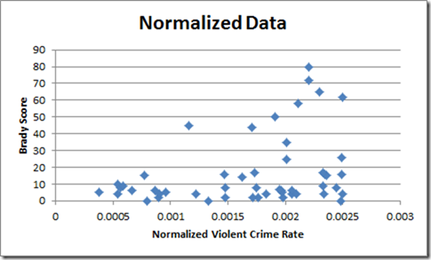
Again, only 3 states, 15%, have scores above 20, and those are all sitting closer to the higher rates. For fun I normalized the violent crime rates (think bell curve), took all the data points within 1 standard deviation of the mean and plotted them relative to their score. The normalized value is an indicator of how close the rate falls to the average mean.
What is notable here is that higher scores are evenly distributed amongst the distribution, along with the fact low scores are as well. It is yet another indicator these scores mean absolutely crap. For reference here is the normalized curve as well as all normalized data with their scores.
TMM is the owner, editor, and principal author at The Minuteman, a competitive shooter, and staff member for Boomershoot. Even in his free time he’s merging his love and knowledge of computers and technology with his love of firearms.
Many know his private name and information however due to the current political climate, many are distancing themselves due to the abandonment of Due Process.


