I screwed up and thankfully someone spotted it. I grabbed the wrong spreadsheet and didn’t double check the UCR data to make sure it was the correct set before moving forward.
So upfront I need to state the following:
- I screwed up, and I used the wrong data set for these graphs initially.
- To many this could be considered misleading and attempting to hide the truth which impacts our credibility. This was not intentional.
- In this post I will show all the graphs affected within this post. I also overwrote the current images to be correct with the 2010 UCS. That is for all of you who hotlink, you don’t hotlink right? At the end of this post I will also attach the spreadsheet used so you can inspect the data.
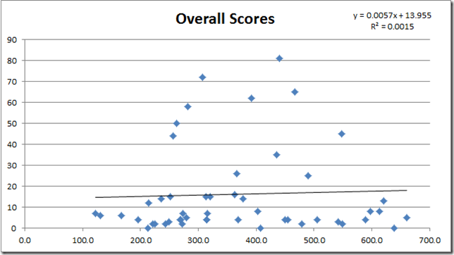
So, up front is the overall scores. It ends up I was helping them, not hindering them.
R2 fell to 0.0015 so it matches the R2 from last September’s numbers. As before it is completely insignificant and there is NO correlation between the Brady Scores and violent crime.
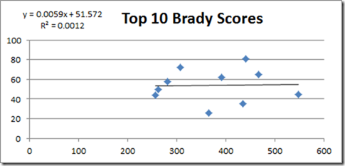
This chart also experienced a rapid decrease in R2. It did have an effect on correlation however bringing it from –0.047 to a whopping 0.034! For those of you who don’t know, that correlation is weaker as the strength is determined by an absolute value. The sign just indicates direction.
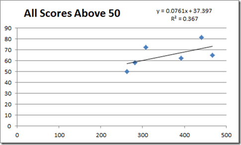
R2 plummeted on this chart. The previous version was 0.613 correlation dropped as well to 0.605. So again statistically irrelevant due to the low sample size, however the trend line is again opposite of the Brady Campaign claims.
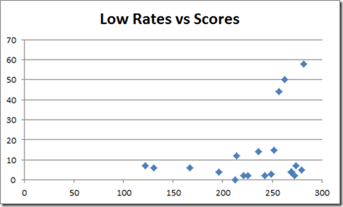
Lastly we have the low rate graph.
Again, there are still 20 states with a crime rate below 300 per 100k. The average Brady score is however did increase to 12.35. Only three states of this group have a score above 20 though. Still all states with a crime rate below 200 are below a Brady score of 10.
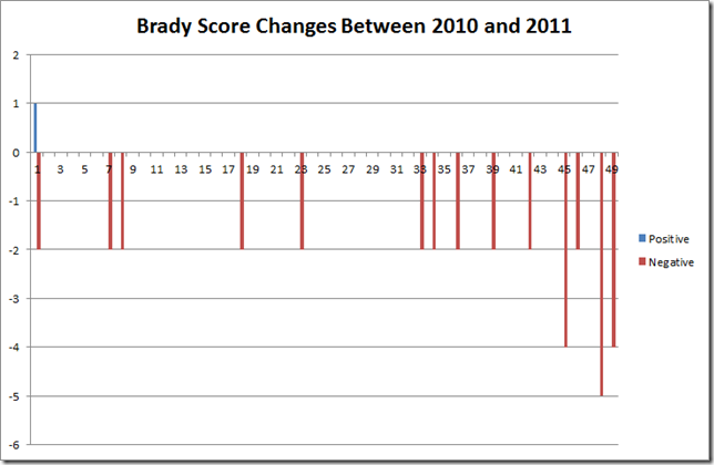
Also the total shift remains unchanged.
You can find the excel spreadsheet below. So in closing, did I screw up, yes I did. Did it affect the results, kind of but not really. What I can say is my screw up wasn’t to our benefit, it was of benefit to the Brady Campaign. Making those changes did nothing but make the correlations worse.
So in closing:
- I screwed up, and I used the wrong data set for these graphs initially.
- To many this could be considered misleading and attempting to hide the truth which impacts our credibility. This was not intentional. What I really did though was aid the enemy.
- In this post I will show all the graphs affected within this post. I also overwrite the current images after duplicating them to be correct with the 2010 UCS. That is for all of you who hotlink, you don’t hotlink right, cause that isn’t nice? Below is my data.
Use the graphs, validate the data, but don’t go stealing my work, this does take time. Just give a link back here and say I did the work. Is it really that hard?
2011 Brady Scores with 2010 UCR XLSX document.
TMM is the owner, editor, and principal author at The Minuteman, a competitive shooter, and staff member for Boomershoot. Even in his free time he’s merging his love and knowledge of computers and technology with his love of firearms.
Many know his private name and information however due to the current political climate, many are distancing themselves due to the abandonment of Due Process.


